In this article, I’ll explain how to set up the board to create a gig poster for a rock band, let’s say that will play on London . And I’ll be using Adobe Illustrator for this in conjunction with Adobe Photoshop.
I’m using Illustrator because of it’s strong typographic feature set. And I’m using Photoshop to add the texture as one of the final steps. Let’s now switch over to Illustrator. I should just mention that I’ve changed a preference.
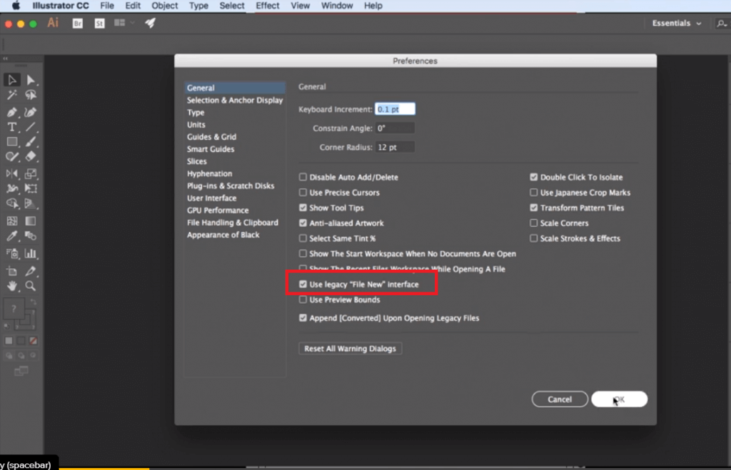
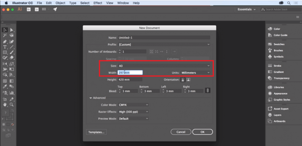
If we look in the general preferences, I’ve chosen to use the legacy file new interface. And I’m also choosing to not see the start workspace when no documents are open, so if your interface looks slightly different to mine those are the reasons why. File and new. Now the size I want to use here is an international paper size of A3. If you are creating this in the U.S. then you’ll want to use the equivalent size of tabloid.
Slightly different but very similar. And I’m going to change my units to millimeters. If you prefer to work in inches then, and need to express any value in millimeters, just be explicit about it and type in mm after the unit and Illustrator will convert that to the inches equivalent. Now because this is a print project and because I am printing to the edge of the page, I want a bleed, standard bleed value is 3 millimeters.
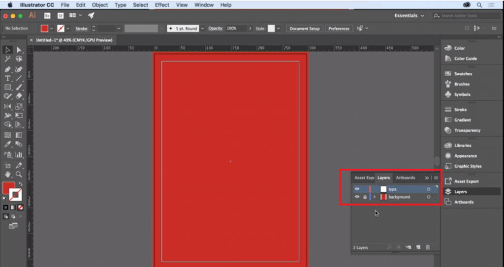
Here’s my new document with the red guide indicating the bleed. I’ll press command or control R to turn on my rulers. I’d now like to just establish a margin which determines my safe area. And I will do this with the rectangle tool. I’m just going to click onto my page and create a rectangle that is the size of my page minus thirty millimeters, allowing for 15 millimeters either side.
So if my page size is 2 9 7 in width then I want this to be 2 6 7. And if my page height is 4 twenty millimeters then I want it to be 3 ninety millimeters. So that’s going to create a rectangle and I’m going to come to my alignment options up here. I want to make sure that I am aligning to the art board. And I will align horizontally centered and vertically centered.
Next I’ll come to the view menu and to guides and choose make guides and that’s going to convert that rectangle into a guide. From the view menu, just make sure that my guides are locked.
Now I’m going to lay down a field of solid color that will be my background color. Choose my rectangle tool once again and draw a rectangle from top left bleed to bottom right bleed. And, using my swatches panel, I’m going to fill that with red and make sure it has a stroke value of none.
Now on my layers panel, I’m going to call this layer background and create a new layer which I’ll call type. And it’s on that layer that I’ll add my text, I’ll come and lock that background layer. And that is all for setting up the proper document to create the magic . Have fun!
