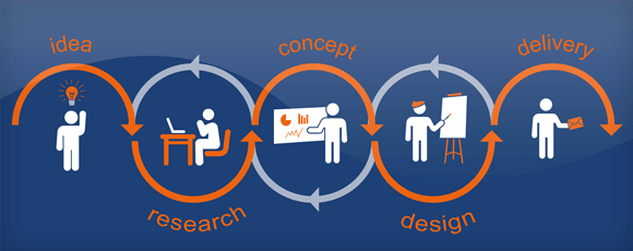
You might be tempted to jump right in and start designing, but first you must collect all of the necessary information. Remember those interrogative or question words from English? Who, What, Where, When & How? That’s the type of information you want to make sure you have before you start working on your design project.
What & Where
What exactly am I making? This is the first question you must ask before beginning any project. Is there a certain size your project needs to be? Will your design be printed in color or grayscale? Where will your design be viewed and from how far away? These are just a few of the question you will want to answer before you begin.
Purpose
What is the purpose of my design? This is the second question you must answer. Before you begin, make sure you are clear about what it is you need/want to convey to your audience through your design. Is the purpose of your design to inform, educate, entertain or persuade/sell? What is the message you want to convey to your audience?
Who (Target Audience)
Who is my audience? This is the next question you will need to answer. Identifying your intended audience will help you determine what sort of images, graphics and typefaces will best appeal to your target demographic. Imagine that you are asked to design a poster to be used on a college campus. It would be easy to assume that your target audience will be college students in general, but you may have to dig deeper.
Are you appealing to English majors? Engineering students? Faculty and staff? Information about the target audience should include age range, geographic location, interests and needs. In the
example above, what would appeal to students may not appeal to faculty and staff. It is always important to know your target audience.
I remember designing a CD for our college concert choir to be used as a fundraiser on our tour to Korea. I had all these ideas for designs that would appeal to college students and I went back and forth with my director many times before I finally realized that my director considered our target audience to be little old church ladies! Then, and only then, did I get the design right. Knowing my target audience up front would have saved me a lot of time and frustration. And, because I finally did learn who our intended audience was, I’m sure we ended up selling more CDs in the long run.
Design Theme
Before beginning a design project, the first thing you must do is identify what Jim Krause (Type Idea Index: The Designer’s Ultimate Tool for Choosing and Using Fonts Creatively) calls the visual personality of the design. Visual personality is the theme or style of your design. Krause likens not knowing the style of your project to getting on the freeway without knowing the name of the city you’re going to.
One way to help you determine the style your project should follow is to write down some descriptive words. On the next page are some words that you might use to get you thinking about your theme. Next, think of ways in which you could depict the words you have just used to describe your project. If you described your project as playful, what might come to mind? When I think of playful, I think of bright colors and fun fonts.
Additional Requirements/Considerations
A few additional things to ponder…
1. How many copies are needed?
2. Will you be printing them inhouse or sending them to a printer? If you’re sending your design to a print shop, it wouldn’t be a bad idea to contact them and see what their requirements are before you begin
3. Grayscale or color? If your design will be printed in grayscale, I suggest designing in grayscale.
4. Are there any elements you must include such as a business logo?
5. Information Hierarchy: How much information must I fit on the page and in what order of importance? Less is more!
Information Hierarchy
What is information hierarchy? Well, the word hierarchy refers to the organization of people, groups or things ranked one above the other according to importance. So the best way to describe information hierarchy is the ranking of information from most important to least important. It is important to decide what exactly it is you need to say and how you want to go about it. One suggestion is to list all the elements of your message and assign them a position of importance from 1-10.
Design element one is going to be most prominent, followed by two, then three, etc.
For example, imagine you have to create a poster to let people know about an important speaker coming to your community to give a lecture. What is the first thing someone wants to know when they see the poster? What it is you’re advertising: who the speaker is.
You can do this with a headline, a picture or both, but it needs to be the most prominent element in your layout. What’s the second thing they want to know? The date and time.
Can the people you’re advertising to come? This should be the next most prominent element. Then you get to the details like where the event will be held, how much tickets are, where to get tickets, etc. So, to review, according to the principle of information hierarchy, what should be the largest, most prominent thing on your poster? The name of the speaker, accompanied by a picture if possible. (People notice images of people first! Make sure the picture is just as prominent as the headline.)
What should be the next prominent thing? The time and date. Information hierarchy also helps you know how to group related information. For instance, you would put the time, place and ticket prices next to each other on the page. To have them all scattered about would be confusing.
You definitely want to make your message as clear as possible. It is important to know if something is adding any value to your design on the whole or not and leave any unnecessary information out. Obviously, you don’t want to leave out important information, but sometimes people seem to think everything is important! You don’t want your audience to have to sort through any extra “stuff” to figure out what you’re trying to say.
Inspiration
I don’t know about you, but sometimes it can be downright difficult to get started. By taking the time to get inspired and organize your thoughts, you will actually work faster in the long run, trust me.
Inspiration can come from just about anywhere but many designers look to other graphic design or art for inspiration. I almost always start my design process by either looking for samples of similar projects online or looking in some of the graphic design books I have on my shelf. I also notice graphic design out in the world: menus at restaurants, packaging, websites, magazines, advertisements, you name it!
After looking at all these other graphic design samples, do I copy someone else’s work? No.
And I’ll be honest, when I first started, I tried. Luckily, I always ended up with my own twist. But seriously, trying to copy certain elements from a design that you really like can be a great way to learn and I actually highly recommend it.
