The WordPress world has a lot of contact forms. Some of them are very basic and easy to set up and others take a bit more work, but they have a lot more flexibility and can do so much more and it’s your job as someone who’s building a site to pick the best tool for the job. The number one thing I want you to take away from this is that there is no such thing as the best contact form.
There might be a best contact form for you or for this particular website, but there is no best, so we’re going to cover the most common form plugins in the WordPress space.
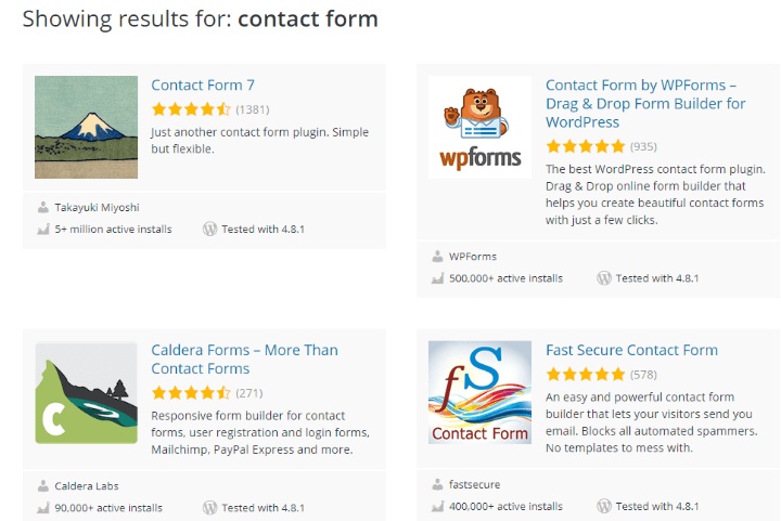
We’re going to start with the free contract form plugins like Contact Form 7 and the contact form built into Jetpack. And later in the article, we’re going to cover Ninja Forms and Gravity Forms which are popular among developers and people that need a bit more functionality out of their forms. There are other contact forms that you could use, but these are some of the most popular.
The best way to find the contact form for you is to come up with a list of goals in the next six months and score each plugin against your goals.
The reason I set a limit of six months on your goals is that it’s easy to dream too big and put too much on your plate. It only takes a few minutes to set up a contact form so if your needs change down the line, you can update your form or entirely swap it out.
If you don’t have any specific goals for your contact form and you’re just including it because you should have it, then you probably want to start with basic forms. They’ll take 15 minutes to set up and you don’t need to spend money on advanced functionality. For that situation, I usually recommend either the contact form built into Jetpack or Contact Form 7.
Here are a few advanced pieces of functionality that most contact forms can’t handle, but some of the more complex forms like Ninja Forms and Gravity Forms can handle.
Autoresponders which lets you send email to users thanking them for submitting the form, conditional logic which lets you show or hide fields based on previous fields filled out in the form, files which let the user upload files along with their form, the look and appearance, some forms give you a lot of control and others you have to custom code, multipage forms can be useful when you want to break the form into smaller bite-sized pieces that the user can scroll through, PDF forms lets you convert form entries into PDFs for easy sharing, saving forms when you have really long forms and you want your users to be able to save their progress and come back to it later, signatures when you need the client to sign a document, submitting posts or content to your site, tabular data in case you need to accept data in a very specific table format, and lastly user registration, do users need to be able to sign up for your site.
If you don’t know what these features are, that’s okay. A lot of these are very niche and are only necessary for very specialized purposes. And the last advanced feature are integrations, so if you want to integrate your form with other services like MailChimp, Zapier, a CRM to manage your customer data, or any service really, then I definitely recommend Ninja Forms or Gravity Forms.
Free plugins are great and I’ve used free integrations in the past, but for those integrations that connect your site to a service, I like to pay for those because that incentivizes the developer to keep the integration up to date.
Sometimes those free integrations are months behind and you might lose data. Now, I just gave you a whole lot of things to think about. The nice thing about contact forms is that they’re relatively easy to switch out, so if you start with something simple and later have to upgrade it, it won’t be a huge chore. I’ll be demoing all four of these plugins so you can see which contact form is right for you.
Before we go deep into the features and setting up each form, it’s important to cover some best practices that will be helpful, no matter what plugin you use. There are entire books written about designing forms, which we’re not going to cover here, but I’ve designed my fair share of forms from scratch and with some plugins, so I’m going to share some of the most important rules of thumb.
The first one is that the more fields you have, the more likely the user will abandon your form. People don’t like filling out information, they want to do the minimum amount of work necessary to solve their problem.
So, if you’re asking for demographic data, like how old they are, they’re likely to abandon your form and never finish it. Only ask for absolutely necessary information to get as many form responses as possible. Now, there is a flip side, let’s say you get 50 leads a month from a contact form, asking you to do work with them.
You can filter out some of the lower quality leads by asking for more information. So, if you have too many leads, then add extra questions, like a drop-down to select how big your budget is, it might drop you down to 40 leads a month and you now have more information to reach out to the hottest leads first.
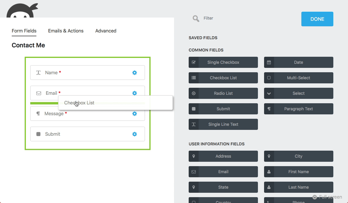
But generally, try to ask for only the absolutely necessary information. The second point is that top left aligned field names are the easiest to read. When you put a field label on the left and the field itself on the right, it requires the user to move their eyes horizontally, constantly. If you place the field label just above the field, it reduced the eye movement and it’s easier to read.
Many forms will let you choose what your labels look like and a very simple conversion booster is to make sure you put your field labels directly above the fields.
The third best practice here, avoid multiple fields on the same line. For the same reason as above, you shouldn’t squeeze multiple fields onto the same line. It makes them really hard to read. If you think you can save a bit of space by scrunching payment and shipping information onto the same line, don’t. Put them on separate lines.
The exception is when someone expects the data to be there, like First and Last Name. Those are expected to be next to one another and you can put them on the same line. In the United States, it’s pretty common to see City, State, and Zip code all on one line when you’re filling out shipping information.
If you’re used to seeing data on one line, you can do so, otherwise, make every field its own line. The fourth point, use a descriptive call to action. A surprising stat is that if you just have a button that says “Submit,” instead of a more descriptive button like, “Sign up and get the best daily tips,” you get 30% less submissions. Filling out forms feels like work and people need to be convinced to actually do it, so make sure to give users a descriptive call to action button instead of the default text, which is usually Submit.
The fifth point, avoid captchas whenever possible. We’ve all seen those annoying captchas that require you to type in the content in a blurry image. They do a good job keeping bots out, but they’re terrible for the user experience. If you have a ton of spam, you may need to use a captcha, but before you do that, try a honeypot field. It’s basically a hidden field that a user will never see, so if a bot fills it out, as they’re programmed to do, the form response will be deleted. It’s a much more elegant solution. We’ll cover honeypot fields later in this course.
And the last point, avoid those clear and reset buttons. I don’t know why these buttons ever became popular. Who fills out an entire form and then wants to start over? Users almost never need these buttons and I have, in the past, accidentally clicked one instead of the Submit button and had to reenter all of the information.
There are dozens of other best practices for forms, which you can Google if you want. The key to remember is that there’s always something you can improve and sometimes, these optimizations are not worth your time. Before you spend 10 hours making the perfect form, make sure you spend time getting people to your site.
Once you have dozen of submissions every month, then it’s worth optimizing your form ever further. Until then, marketing your site to get more visitors is the best way to get form submissions.